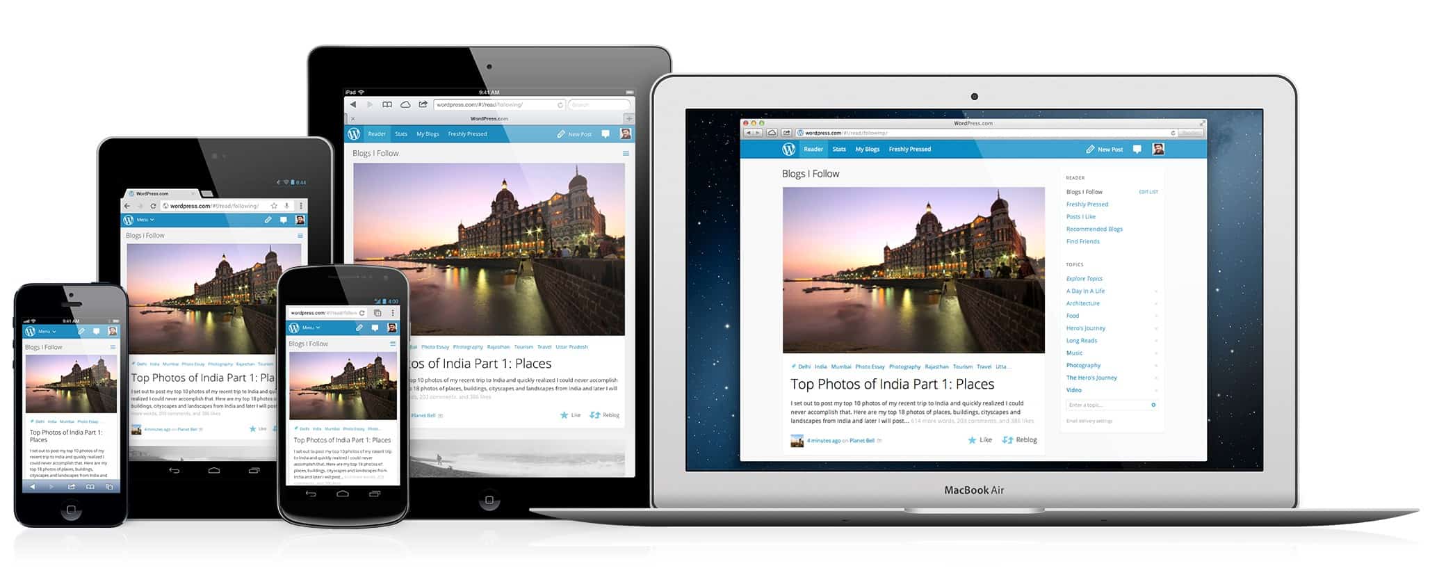
Responsive Design

Now with over half of all Internet traffic coming from smart phones, a website absolutely must work properly on a smart phone or you take a chance on losing website visitors, leads and sales. The younger your target market, the more critical it is to stay on top of the latest website technologies because they are the fastest to leave your website if it isn’t working for them on their phone.
For about a 2-5 year period, the quick solution was simply to create a mobile website, or use a plugin on your website that automatically created a mobilized version of your website, but those days are over. People want to see your website fully, not some alternate version of your website.
Along comes Responsive Design, which has been around for 10 years or so, but only widely adopted as THE standard for website design in the last 2-3 years.
At XEARA, we design all new websites with one of two Responsive Design Templates specifically built for WordPress. We have found these two to be the most versatile of all we have tested, and allows us to build almost anything we can dream up, and still achieve perfect website designs for our clients.